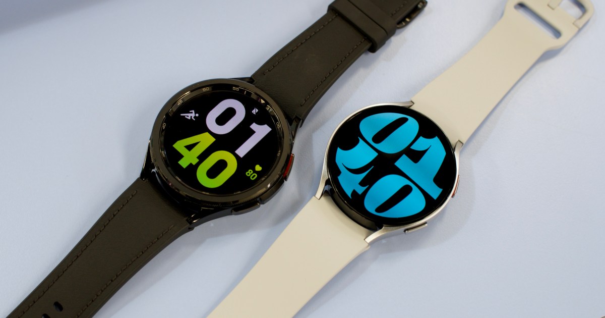
Right when Apple is reportedly prepping a major design overhaul for the Apple Watch ahead of the upcoming 10th anniversary edition, we are hearing rumors that Samsung is also chasing a similar goal. A SamMobile report claims Samsung is finally going back to its smartwatch roots, eschewing the round display on its current-gen Galaxy smartwatches in favor of a rectangular dial.
“The idea is enthusiastically being considered internally and it’s very much on the cards that the switch is going to happen,” says the report. We don’t know whether the design shift is going to happen this year or the next. However, if the design project is a fresh endeavor, that leaves a very tight window for the upcoming Galaxy Watch 7 series, which is scheduled to arrive in the next few months.

It’s plausible that the redesign has been saved for the next iteration or maybe even later. Product design isn’t exactly an easy job, and something as dramatic as changing the entire form factor will take both hardware and deep software-level optimization.
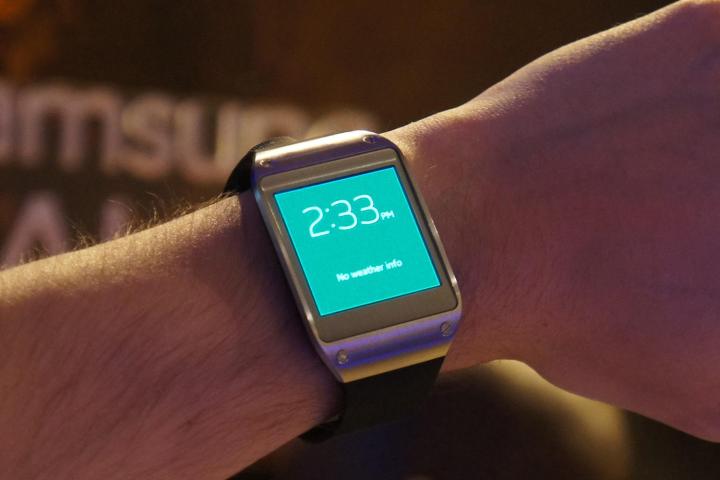
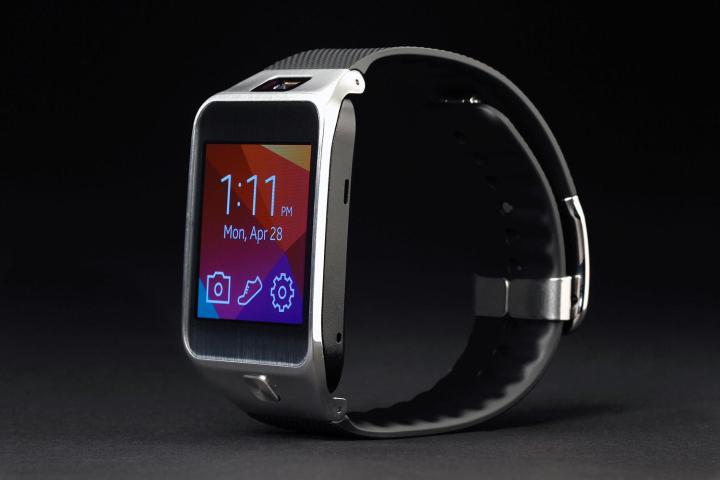
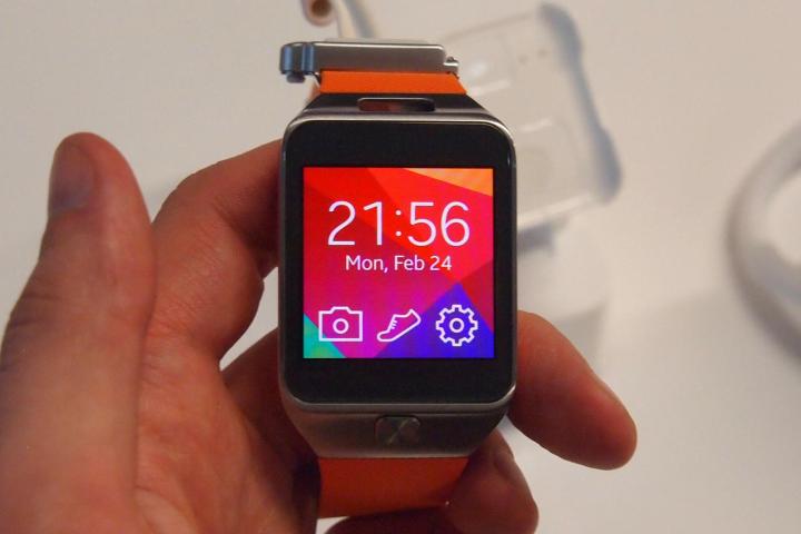
Where Apple has remained loyal to the rectangular display format for nine smartwatch generations, Samsung has gone in both directions. In the early days of the smartwatch hype, Samsung arrived on the scene with the Galaxy Gear in 2013. In fact, it was even more ambitious than current-generation smartwatches.
Priced at $299, the Galaxy Gear served a rectangular 1.63-inch Super AMOLED display with a respectable 320 x 320 pixels of resolution. It was a beautiful timepiece, blending a metallic frame with straps offered in a bevy of styles. Samsung also armed the watch with a 1.9-megapixel camera that could shoot HD videos. It had a handful of other cool features, too.

Back then, a paltry selection of apps and a rough user interface were its biggest shortcomings. Fast-forward to 2024, when Samsung has had a decade’s worth of experience serving Tizen OS (and more recently, Wear OS) on smartwatches, and the time seems ripe for the company to experiment.
Now, I am not saying Samsung should put a camera on its rumored Galaxy Watch refresh. But a rectangular display has its own share of benefits, even though it doesn’t ascribe to the holy aesthetic rule of a wrist-worn timepiece. But hey, not too long ago, Apple was selling gold-heavy $17,000 editions of the Apple Watch, and they didn’t look half bad.
A rectangular screen makes it easier to interact with notification cards, especially on a platform that is already struggling to make the best of every pixel available. Round smartwatches leave comparatively little space for scrolling past notifications or any other UI element, allowing only the centerpiece to unfold in full, while content at the top and bottom is sacrificed to the round edges.

The Apple Watch’s rectangular screen allows it to avoid that problem to a large extent. Plus, I’ve already experienced the beauty of Wear OS on the Oppo Watch, and I survived the experience without losing my patience and writing long Reddit rants about the fallacies of a rectangular screen on smartwatches.
I am just hoping Samsung manages to somehow address the battery concerns, especially on the smaller trims, assuming it decides to go with the rectangular makeover. But at the same time, I am also ready to write a glowing obituary to the beautiful times of a rotating dial on the Galaxy Watch Classic series.
Editors’ Recommendations


